MAKE.EXE 2026
Huge — Brand Identity & Motion Design

MAKE.EXE is Huge’s live design competition, bringing creatives together for a series of fast-paced design challenges.
For its 2026 edition, I helped refresh the visual identity to feel faster, more competitive, and gaming-inspired while aligning it with Huge’s new brand system.
My role spanned brand, graphic, and motion design, including identity development, logo animation, iconography, kinetic typography, and graphics for the live event and broadcast.
July - August 2026


Footage from MAKE.EXE 2025 LA
Logo Rebrand

2025

2026
For 2026, MAKE.EXE was being livestreamed for the first time, which became a key idea behind the logo refresh. The square from the previous identity was transformed into a circle that doubles as a live indicator, referencing the red dot associated with live broadcasts. The shift also connects to Huge’s rebrand, which introduced a softer, rounder typographic language.
The icons embedded within the letterforms were also redesigned. While the previous identity used broader tech-inspired symbols, the new custom icon set directly represents MAKE.EXE—referencing the design process, the competition’s location, and its second round.
Together, these updates make the logo more specific to the 2026 event while preserving the recognizable structure of the original MAKE.EXE identity.
Logo in Motion

2025

2026
The core motion language of the original logo loop was preserved to maintain continuity with MAKE.EXE’s existing identity. For 2026, I pushed the animation further into a tech-driven visual language, using digital glitches, rapid transitions, interface-inspired movement, and more mechanical motion.
The result keeps the energy of the original loop while giving the new identity a more technical and competitive feel.
Motion Explorations

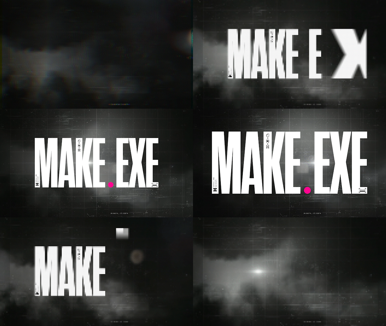


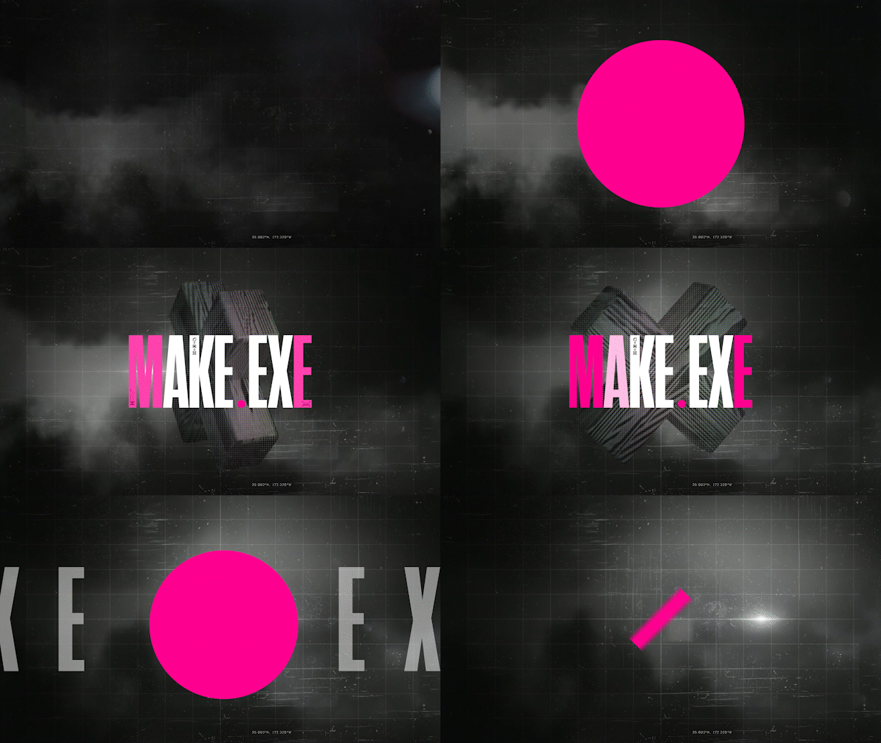
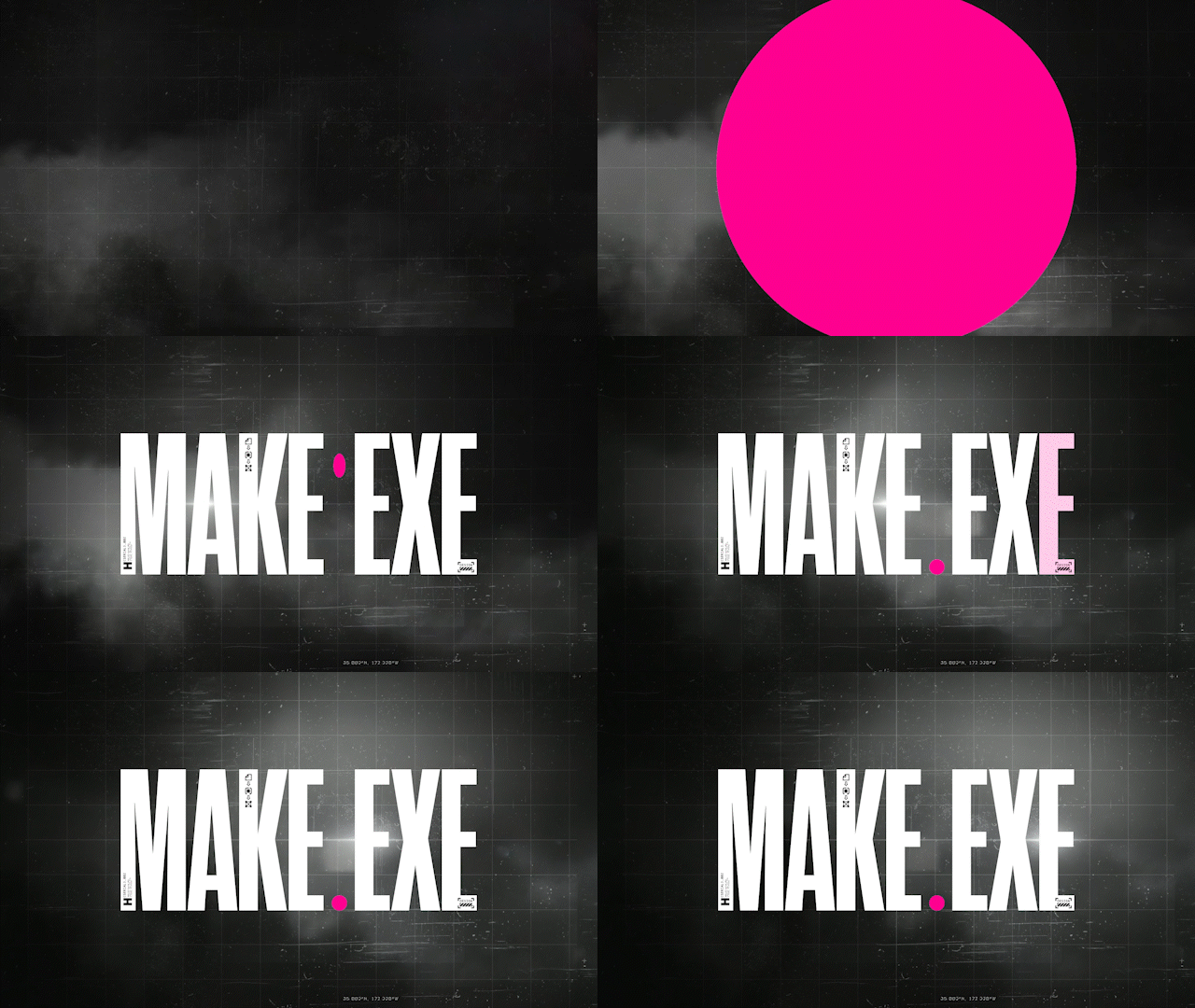
A series of shorter logo loops were created to explore the motion language before developing the final animation. Each experiment tested a different balance of playfulness, competitiveness, and tech-inspired motion.
Some of these explorations became building blocks for the final logo loop, while others remained experimental studies that helped define how the MAKE.EXE identity should move.
Iconography


I developed a custom iconography system built around the design process, competition format, and New York City location of MAKE.EXE 2026. Rather than using generic tech-inspired symbols, each icon was designed to connect directly to the event and its experience.
The icons became a flexible visual language that could live both within the logo and independently across the identity, extending into motion, graphics, and event applications.
Stickers
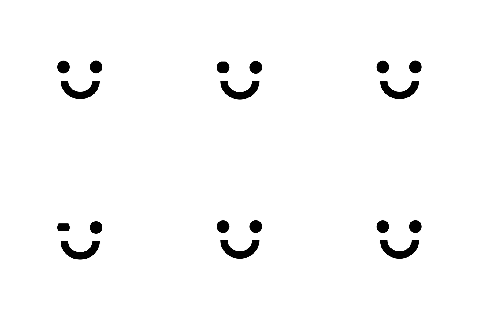



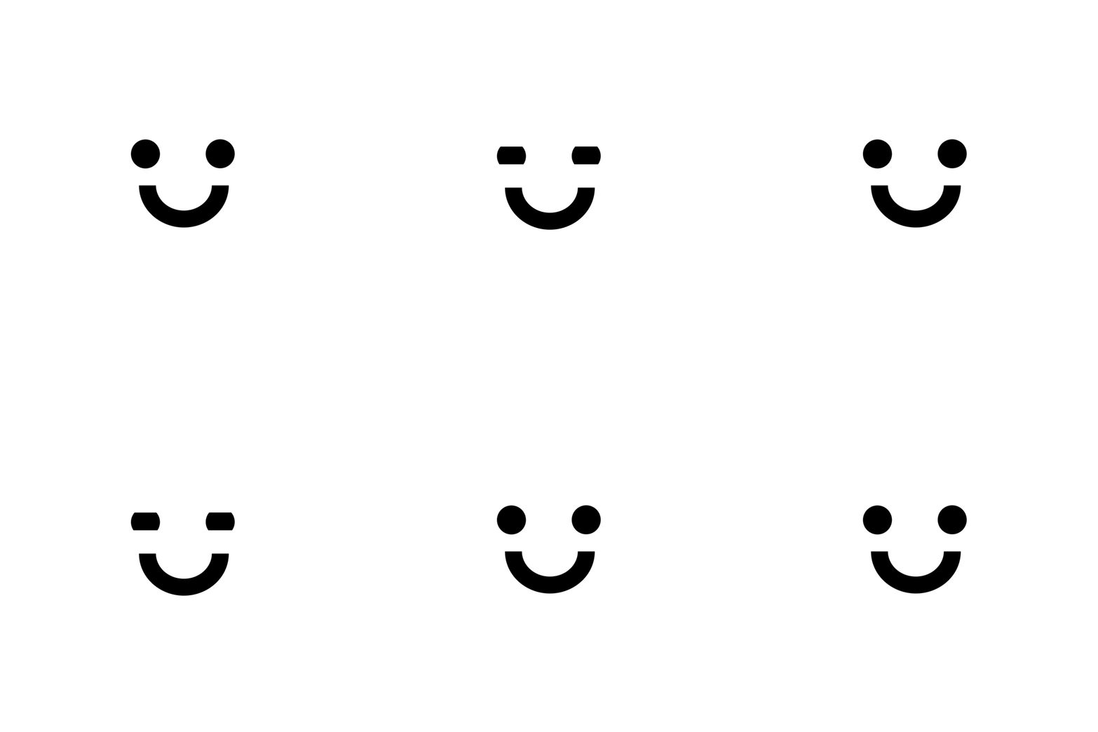
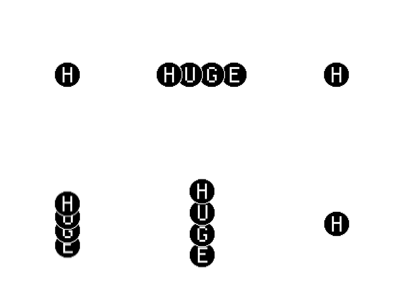
The iconography was expanded into a set of stickers that brought a more playful and expressive layer to the identity. Combining custom icons, typography, and MAKE.EXE messaging, the stickers helped balance the system’s technical and competitive aesthetic with the playful energy of the event.
Competition & Broadcast Graphics


I developed a series of styleframes for competitor cards and promotional and broadcast materials, extending the MAKE.EXE identity into the live event experience.
The graphics combine bold typography and tech-inspired visual elements to create a cohesive system that introduces the competitors, builds excitement around the competition, and carries the identity across promotional and livestream content.
Livestream Interface
Final Selection


Iterations


I explored multiple UI directions for the MAKE.EXE livestream, experimenting with layout, hierarchy, and ways to integrate the event’s visual identity into the viewing experience.
The iterations were reviewed by the team, leading to the final selected direction.
Countdown

I designed and animated an ultra-wide 10,500 × 1,080 countdown graphic for the live event, translating the MAKE.EXE visual language into a large-scale screen experience.